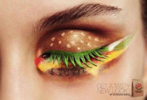
The latest advertising campaign for Burger King Netherlands certainly can’t be categorised as boring and predictable.
The ad, which shows a woman’s eye emblazoned with bright eye shadow and clever painting effects, is a simple and effective way to get the message across about their product and new look.
From the eyelid bun to each carefully designed filling, the design is a great way to attract attention. What do you think on Burger King’s newest eye catching a… Continue reading


